Welcome to Domestic Diva blog

Categories
Interior Design Style Welcome

Welcome to Domestic Diva, the blog page for Grace Your Dwelling Place™. I’m so glad you’ve found it and since you have, I can only presume that we have a few things in common or you wouldn’t be here.

I’ve always been a bit of a Domestic Diva having learned from the best – my parents. They are of the Silent Generation and know how to make do with whatever comes their way. From my first-generation Italian-immigrant mom I learned how to cook, clean, sew, entertain, and decorate within budget. And from my dad the builder how to resourcefully use leftover lumber, paint, and other construction components to improvise and creatively solve design dilemmas. Not to mention how a functional home plan purposefully serves its people. And from them both, how to organize and manage a household. But foremost of all – how to faithfully serve with love.

Furthermore, it’s been such a lifelong blessing that they also provided travel experiences infusing my desire to enthusiastically embrace worldwide encounters of place and culture. I encourage you to do the same and to encompass your experiences into Your Personal Home Style.

My hope is to grace and be graced in our interactions here as we share and embrace each other’s domestic and international experiences, especially as they pertain to Your Personal Home Style.

Common Interests in Domestic Design

Some things we may have in common:

  • Being of a certain age group…let’s call it experienced adulting (meh, maturity is another matter)
    • A desire to “age-in-place” for yourself or loved ones
  • To Live Well Where You Dwell©…regardless of age:
    • aesthetically
    • efficiently
    • entertainingly
    • financially
    • functionally
    • safely
    • spiritually

All the above is what this blog and I am about. With the intent to purposely inspire, enlighten and guide you in being able to Live Well Where You Dwell©, to embrace where you’ve been and evolve to where you are now and where you are going.

Why the Domestic Diva blog title?

My Domestic Diva blog title was a moment of pure inspiration. Domestic Diva does a darn good job of describing my knack to pull together and manage a household that’s functional while being beautiful. And those homesteads that I’ve helped along the way are welcoming for all dwellers and visitors of any age/ability. At least, I like to think so and have even been told so.

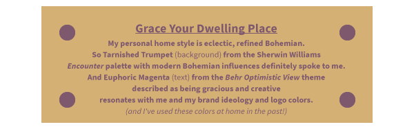
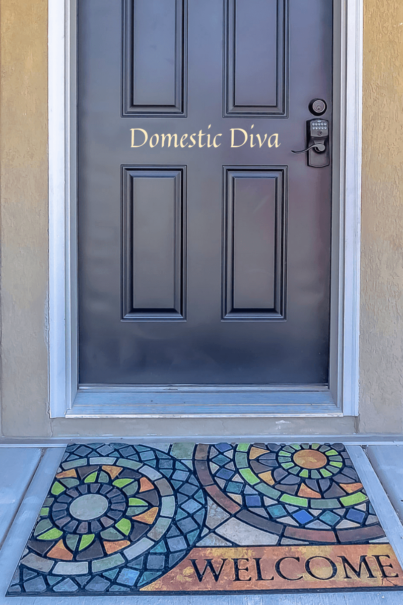
It’s pure providence that my welcome image captures the essence of my being and design biz. The Welcome mat conveys my forte of pattern and color dance interplay. While the “stained glass” represents a deeper, spiritual sense of purpose in interior design to Live Well Where You Dwell©. The traditional door with the discreet modern combination key lock characterizes how we can collaborate to unlock the potential of Your Personal Home Style.

Domestic Diva Definitions

I ran across a couple compelling definitions for domestic diva:

  • domestic diva is NOT a victim, of time, position, or male society. She is a servant in the great sense of the word, as one who serves her family and friends for the sake of love. And her home is the medium through which she serves that family best (from I want to be a domestic diva: what do I mean?).
  • A housewife who is beautiful and fabulous but hard-working. Making a fashion statement while doing housework is a must! She’s usually multi-tasking by taking care of the kids, cooking, cleaning, [bill-paying, household management] etc. while wearing her cute little aprons and high-heeled shoes. It’s all about looking good while doing it (from Urban Dictionary: Domestic Diva).

Remember June Cleaver from Leave It to Beaver?

Meh…NOT so much into the June Cleaver housewife image of doing household chores in heels. I rather prefer the practical aspect of getting the job done comfortably and quickly! Can’t currently claim the wife title either, but I can rock the high heels. I also have a couple cute little aprons!

Cute Vintage Apron

My Domestic Diva Topics

I am particularly passionate about all things that make a house a functional, beautiful home and reflects the personality of people who dwell and visit there. So, let’s nail it down to a few…

Topics I will blog about:

  • Home Functionality
    • Floor Plan/Furniture Arrangement: relationships between furniture, spaces, traffic patterns, and other physical features plus activities that will take place in a room dictate the selection and arrangement of furniture.
    • Lighting, properly done can enhance task performance, improve the appearance of an area, and have positive psychological effects on dwellers.
    • Organization: Declutter. Categorize storage. Multi-purpose/repurposed space.
  • Aging-in-Place, aka Universal Design
    • Nearly 90% of people over age 65 want to stay in their home for as long as possible, and 80% suppose their current residence is where they will always live. How can your physical environment accommodate aging-in-place?
  • Personal Home Style
    • Color
    • Pattern
    • Collections/Heirlooms/Mementos that influence your home style
  • Holistic
    • Mindful, Physical, and Spiritual Places of Grace travel experiences and other sources of enlightenment that influence home style
  • HouseHold Hacks aka HHH
    • Manage the House: Budget. Calendaring/Scheduling. Maintenance.
    • Green Cleaning: Natural. Methods. Essential Oils (EO).
  • Product Recommendations/Reviews
  • Real Estate Trends
    • Remodeling Value
      • Stay or Move
    • Market Overview

Who writes this Domestic Diva blog?

I will, for now, be the soul author/contributor to this blog. But I totally welcome your blog posts response comments and/or suggestions for blog topics. Please be respectful though and keep my blog rules in mind as outlined below.

Blog Rules of the Road

I welcome interactions with my followers. You are welcome to post questions, comments, concerns, or ideas on this page. My goal is to build a community where my followers can share content, express their ideas, share experiences, and provide helpful information to each other. Please note the rules below for this site and understand that I reserve the right to remove any post that does not comply.

  • Be respectful of others. It’s okay to voice a complaint or to disagree with another post, but please do so in a constructive and polite manner. Profanities, personal attacks, defamation or use of obscenities about any person, group, organization, or belief are not acceptable and will be removed.
  • Check your facts. If you post something that isn’t true it will be removed.
  • Your posts should always be relevant to Domestic Diva content. Do not use this site to promote any other business, political candidate, or other causes…they will be removed.
  • Negative posts are not allowable.

Protect your privacy. Your comments are visible to all. Never include your phone number, e-mail address or other personal information in a post. If you want individual follow-up, send a message through my contact page. You are legally responsible for the comments you post.

By posting any comments, links, or other material on Grace Your Dwelling Place™ website or social media, you give Grace Your Dwelling Place™ the irrevocable right to reproduce, distribute, publish, display, edit, modify, create derivative works from, and otherwise use your contribution for any purpose in any form and on any media. You also agree that you will NOT:

  1. Post material that infringes on the rights of any third party, including intellectual property, privacy, or publicity rights.
  2. Post material that is unlawful, profane, obscene, defamatory, threatening, harassing, abusive, slanderous, hateful, or embarrassing to any other person or entity as determined by Grace Your Dwelling Place™ in its sole discretion.
  3. Post ads or solicitations of business.
  4. Post the same information more than once (aka spam).
  5. Post chain letters or pyramid schemes.
  6. Impersonate another person.

Open the Domestic Diva Door

I do take pride in my inherited, instructed, and intuitive abilities to make a house a home which is what this blog is about…being a Domestic Diva. You are invited to join me on your personally guided domestic journey to Live Well Where You Dwell©


2021 Color of the Year Contemplation

Categories
Interior Design Style

Colors of the Year Contemplation

Have you ever contemplated how the “Color of the Year” is determined? Being in the color business one way or another for nearly half a century, I have frequently wondered about its origins. To satisfy my curiosity (and maybe yours) I’m taking a deep dive into its roots. I consider it an art and science thing based on CIPAD (my acronym for Color Inspiration, Psychology, and Anthropology in Design – kind of the opposite of insipid… bonus that it rhymes – since color is anything but dull or lifeless). Note: This blog is not about color theory which is based on colors organized on a color wheel and grouped into 3 categories: primary colors, secondary colors, and tertiary colors. But rather this is an article about how the major paint companies determine their Colors of the Year.

History of The Color of the Year

 “The Color of the Year” is a clever way to influence design choices, market paint products and prompt consumers to live on trend. The Pantone Color Institute introduced its Color of the Year concept more than 20 years ago.

Shortly afterwards, as you may have noticed, other paint color companies e.g., Benjamin Moore®, Sherwin Williams®, Behr®, and others began to release their own Color of the Year palettes for their version of the hottest hues for any given year.

For 2021, the Benjamin Moore® Color of the Year is a subcategory of their Color Trends palette with 12 hues in it. While Behr® has their Color Trends Palette, and Sherwin Williams® has their Colormix® Forecast for the Color of the Year. We will also explore colours on the other sides of both big ponds: Farrow & Ball® in the UK and Dulux Australia®. These are all major international paint companies that are available in the US.

It all started in 1963 when Pantone introduced the colorful PANTONE MATCHING SYSTEM® to the printing world. Along the way, Pantone has grown to embrace a Universal Language of Color that aids color-critical decisions for brands and manufacturers.

There are several divisions within the Pantone domain. With the Pantone Color Institute providing customized color standards, brand identity and product color consulting as well as trend forecasting that includes the Pantone Color of the Year, Fashion Runway Color Trend Reports, color psychology and more.

For our home furnishings discussion, it’s the PANTONE LIFESTYLE division where color and design cross paths for lifestyle-oriented industries – apparel, home, and accessories – inspiring daily life with purposeful color and patterns. If you want to know more About Pantone click here.

Keep in mind that the Pantone Color of the Year is a broad color stroke that is important to multiple industries. Whereas Benjamin Moore®, Sherwin Williams®, Behr®, Farrow & Ball®, and Dulux Australia® are home décor paint palettes.

So, let’s evaluate the various 2021 Colors of the Year for your home from the ideas of inspiration, color psychology, and cultural anthropology. But first, let’s define what those terms mean in general and how they relate to color at home.

Color of the Year Philosophy

Inspiration is the creative concept producing excitement in your mind or emotions to a high level of feeling or activity. Sometimes, inspiration may also be felt in the form of Divine guidance directly sensed by a human mind or soul. In other words, we are emotionally influenced and sparked into action by an idea (or color) that produces deeper meaning to a project or purpose.

Color Inspiration

Pantone explores the globe for color influences to select its Color of the Year. They are inspired by pop culture, film, popular travel destinations, socio-economic conditions, organic elements, art, fashion and so much more.

The Color of the Year greatly affects what products are made as well as our purchasing decisions across a variety of industries from fashion, industrial design, product packaging, graphic design, and home goods. All of the home paint color brands follow Pantone’s path searching the world for color inspiration encouraging you to Live Well Where You Dwell©.

Psychology is the science of mental processes and behavior concerning the subtle strategic action or reason used to manipulate or influence another person.

Color Psychology

Color affects human behavior. It influences our opinions that may not be obvious in creating subtle consequences. We may wonder why we are more or less comfortable with certain colors or in particular environments. A color that creates one reaction in one person may create the opposite reaction in another because of cultural/ prior associations, or even just personal preferences. There is even psychology in creating the color names.

In any given year most of the paint companies title their palettes to “inspire” you. No matter how they label it the accord for 2021 is that there is a need for optimism, balance, and natural harmony at home. Your color choices at home can affect your personal well-being and what you bring forth to the world.

So with that, let’s explore the titles of this year’s color collections. We’ll call the  Benjamin Moore® palette “Settle In”;  Sherwin Williams® describes theirs as “Rhythm of Color”, and Behr® titled theirs “Elevated Comfort”; Grace Your Dwelling Place® characterizes it as “Live Well Where You Dwell©”. The paint companies across the ponds didn’t title their 2021 trend palettes.

The inspiration for the transformative spirit of color and what the world needs now is heavily dependent (in my opinion) on the psychological aspect. Thus, this section is more thorough than the other philosophy sections. Psychology is a very strategic part of the color selection process that also includes inspiration and anthropology.

In general, colors may have the following associations:

  •  Red: Passion, Love, Anger
  •  Orange: Energy, Happiness, Vitality
  •  Yellow: Happiness, Hope, Deceit
  •  Green: New Beginnings, Abundance, Nature
  •  Blue: Calm, Responsible, Sadness
  •  Purple: Creativity, Royalty, Wealth
  •  Black: Mystery, Elegance, Evil
  •  Gray: Moody, Conservative, Formality
  •  White: Purity, Cleanliness, Virtue
  •  Brown: Nature, Wholesomeness, Dependability
  •  Tan or Beige: Conservative, Piety, Dull
  • Cream or Ivory: Calm, Elegant, Purity

Here are some reasonings regarding the noteworthy color palettes for 2021.
Blues and Greens:

Cool colors include green, blue, and purple which are often more subdued and understated than warm colors. They are the colors of night, of water, of nature, and are usually calming, relaxing, and somewhat reserved. Think of how the sea and sky provide subtle focus and calm.

Warm Neutrals:

Neutral colors often serve as the backdrop in design. They’re commonly combined with brighter accent colors. But they can also be used on their own and can create a very sophisticated mood. The meanings and moods of neutral colors are much more affected by the colors surrounding them. The warm neutrals of 2021 suggest a warm, cozy space that feels natural and earthy providing a casual comfort.

Vibrant and Playful Jewel Tones:

It makes sense that in unsettling times we want to make our homes feel as warm and welcoming as possible. Rich red/purple tones do just that by adding coziness to a room. Touches of lavish bold hues can easily be mixed into a neutral room for a touch of luxurious comfort producing a sense of optimism.  A vibrant yellow is believed to heighten awareness and enhance intuition.

“Our most basic [color] associations started with our instinctive need to survive…”

Anthropology is the scientific study of human societies and cultures based on the circumstances of environment and development. There is also a part of Christian theology concerning the origin, nature, and future of humans, especially as contrasted with the nature of God.

Color Anthropology

Color is hardwired into the human experience. From the very beginning, color informed our daily lives. In his book Color Inspirations Darius A. Monsef IV says, “Our most basic associations started with our instinctive need to survive[…]blue water to quench our thirst,[…]red fire for warmth,[…]green plants for food.”

Our relationship with color has evolved to express emotion, class, and spirituality. Each hue has its own deep history of meanings. Color may have different meanings and responses across cultures and environments. Cultural differences can affect the perception of a hue’s meaning – while a hue that’s happy and uplifting in one country might be gloomy and depressing in another.

Color of the Year Analysis

Summarized below are each paint brand’s Color Palette with their featured “color of the year” shown as the background color and one of their coordinating colors (of my choosing) used as the text color. Descriptions point to each brand’s inspirational, psychological, and anthropological reasonings.

At first glance, Do any of the colorways below jump out and speak to you? Do you agree with each brand’s “why”? What is your “why” for your choice?
Pantone Color of the Year 2021 Ultimate Gray (background) plus Illuminating (text) which together convey being practical and rock solid but at the same time warming and optimistic - a color story that captures deeper feelings of thoughtfulness with the promise of something sunny and friendly.
The BEHR Color Trends 2021 Palette is a curated selection of hues organized into six color themes: Casual Comfort, Subtle Focus, Optimistic View, Quiet Haven, Calm Zone & Outdoor Escape grounded in what we've been craving: comfort and personal home style. Canyon Dusk (background) is their Color of the Year from the Subtle Focus theme; Nocturne Blue (text) is from the Quiet Haven theme.
Benjamin Moore 2021 Color-of-the-Year Aegean Teal (background) is their one special hue that nourishes the spirit and is perfectly accented with Chestertown Buff (text). Their Settle In palette of 12 comforting, sunbaked shades --- radiating warmth and well-being --- has been carefully curated from their library of 3,500+ colors.
Dulux Australia 2021 Colour-Forecast has Retreat, Nourish and Reset as their three nurturing palettes that evoke familiarity and comfort. Terra Rose (text) from the Reset palette is the apparent Dulux Color of the Year with Olive Blend (Nourish), Snowy Mountain Half (Reset - backgroun), and Five Fingers Peninsula (Retreat} being sub-featured colors.
Farrow & Ball 2021 color forecast consists of four palettes without a gray in sight. (Yay for no gray!) From each palette there is one featured color for their Colors of the Year: Rich Jewels Hues (Preference Red - text), Calming Natural Greens (Sap Green), Warm Earthy Colors (Jitney (background) - featured Color of the Year), and Clean Simple Blues (Stiffkey Blue).
Sherwin Williams 2021 Colormix Forecast methodology particularly appeals to me with their take on rhythm being the secret to how the natural world stays in step. They have 40 trend colors presented in four palettes: (Continuum, Encounter, Sanctuary, and Tapestry) guiding you into a lovely rhythm of life at home. Color of the Year is Urbane Bronze (background} from Sanctuary. Swimming (text) is from the Continuum collection.
Grace Your Dwelling Place My personal home style is eclectic, refined Bohemian. So Tarnished Trumpet (background) from the Sherwin Williams Encounter palette with modern Bohemian influences definitely spoke to me. And Euphoric Magenta (text) from the Behr Optimistic View theme described as being gracious and creative resonates with me and my brand ideology and logo colors. (and I've used these colors at home in the past!)

Color of the Year Conclusion

Have you noticed how all the colors across all brands easily mix and match, coordinate, and interchange with each other? I wonder…do these companies consult with each other?

 All of the brands’ 2021 color palettes include neutrals mixed with some lavish bolds to create energizing yet comforting zones in a home. Then there are the counterpoints of the calming cool lighter colors that balance the palettes with tranquility. Overall, the philosophy behind the 2021 color palettes totally embraces my mantra: Harmony and Balance at home to Live Well Where You Dwell©

I quite like many of the colors in all the brands’ palettes. Thinking I might repaint a bathroom (including the ceiling) and possibly add some accent décor pieces here and there elsewhere. Are you inspired to refresh your home?

In the final analysis let’s summarize CIPAD as: “Color inspires us to behave as our own particular person based on our experiences and environment.” Please don’t be a chaser of trends – be your own person and incorporate what works for you. I’d be happy to help you!